This is the Story About the Story of the 100,000th Big Cartel Store (Part 1)
- 18 October 2010
- ByDan Christofferson
- 4 min read

I got a text from Lillian Crowe right before she hopped on the subway saying she would lose service for a bit and she would shoot me a note when she resurfaced. I wrote down a few questions about her products and background and admired her logo, a monogram made of rope curling into the initials L C.

I’d looked at her logo and shop a bit as i worked on some ideas for our 100,000th customer virtual balloon drop. I was really excited to talk to her and see where her creativity and inspiration came from. She got out of the subway, sent me a text, and I called her to do a little voice to voice phone interview. She was, of course, really nice, charismatic and passionate about her craft. She was driving a friend’s car through Brooklyn and gave me little warnings along the way, of possible road rage outbursts as she drove through a battlefield of Brooklyn drivers.
We talked for a while about her background and I could hear how much she loved being in and around New York. I mentioned that her products reminded me a bit of relics an ancient civilization would leave behind, only to be found by aliens visiting a deserted planet. They have this magnetic mystery to them and i think that’s part of her charm. I told her we would love to sponsor her store and would be delivering a little gift, she thanked me generously and we set up a delivery time.
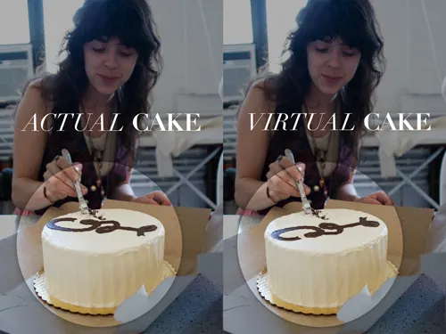
A few days later, after some phone tag and delivery orchestration, I had a baker and a photographer from Brooklyn heading to meet our girl at her studio. It was a gorgeous day in New York and everything came together perfectly. The cake was delivered with only a minor set back/logo reversal-

The photographer (Amy Angelo) and Lillian got along great and sent us a batch of shots documenting the day.
(check out our flickr at: flickr.com/photos/indielabs for some more photos from the cake delivery.)
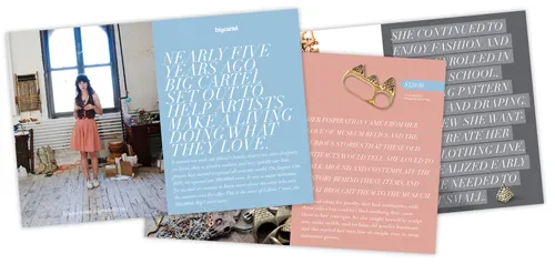
Then it came down to designing the spreads with the right tone. The interview article was originally planned to feel more like a magazine. I imagined editorial spreads that could be clicked through from page to page to feel a bit more casual, like some Sunday morning reading. The shots we received from the photographer had a color scheme inherently woven through them, i used the pinks, blues and grays to create a feel of nostalgia. The type I used had that same intention.

I used Didot, a more traditional, French typeface, then set it with minimal linespacing and a vocabulary of more contemporary visual styles. We started to feel like the piece could definitely be infused with more interactivity and came up with some ideas using some inspiring, online type tools. I worked closely with Chance as he took what I designed and gave it some life…. (stay tuned for part 2)
18 October 2010
Words by:Dan Christofferson
Tags