Picklejuice in Action
- 14 August 2014
- BySarah Anderson
- 2 min read
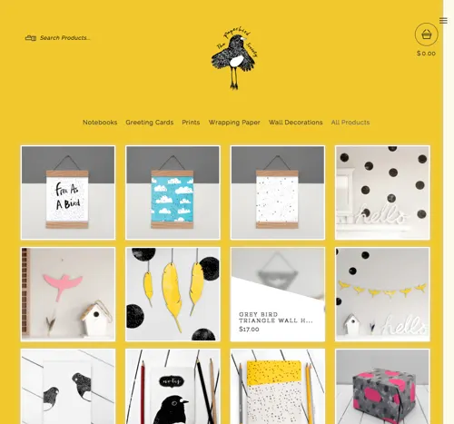
We’re noticing more and more shops updating their look with the newest theme, Picklejuice. And we gotta say, we’re impressed.
A handful have caught our eye, and we’ve put together a list of our favorites below. We’ve even noted the settings used to customize each shop to help jumpstart that store update you’ve been putting off.

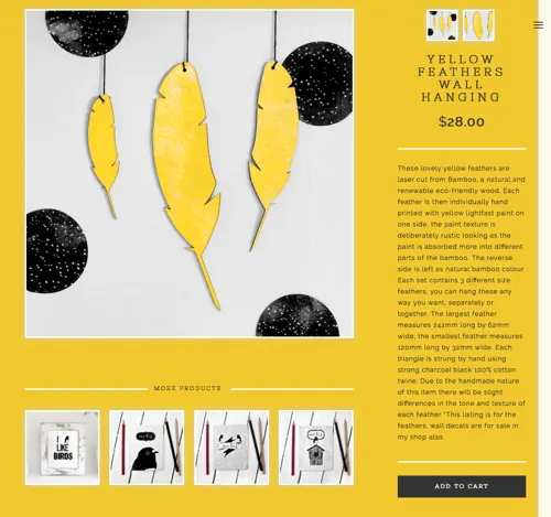
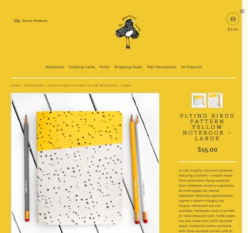
The Paperbird Society’s edited color palette makes their collection feel cohesive, and extends to their shop design, making the products and their brand feel connected. The "More Products" section on the product page helps customers discover more items.
Primary color:
Secondary color:
Primary font:
Secondary font:
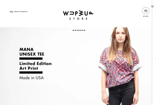
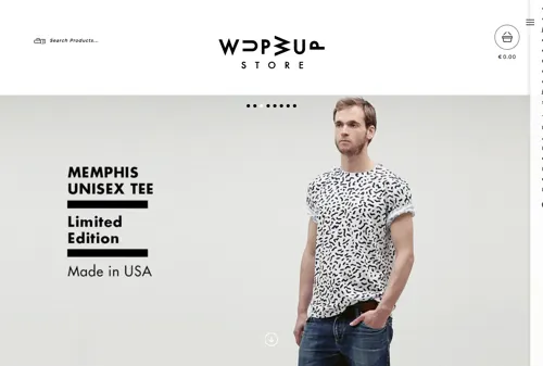
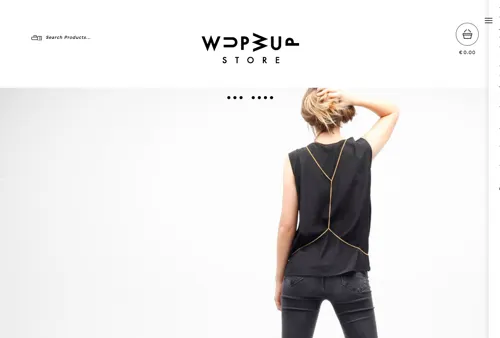
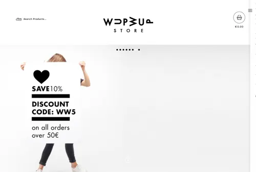
Visiting WupWup’s homepage feels like flipping through a catalog. Clean photography and basic product information help shoppers visually try on a piece, while a large image with a discount code encourages sales and instantly rewards new customers.
Primary color:
Secondary color:
Primary font:
Secondary font:
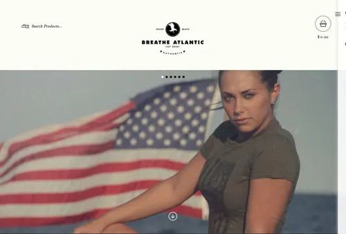
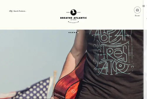
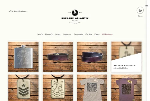
To match their nautical vibe, Breathe Atlantic gave their shop a well-worn look. The warm white background feels cohesive with the muted product color palette, and the deep red accent color gives this store an old-school Americana feel.
Primary color:
Secondary color:
Primary font:
Secondary font:
With the restrained color palette and font choices, Picklejuice takes only a few minutes to customize. This foolproof design keeps a sharp focus on products with all other details stowed discretely in the right-hand side menu. Ready to try? Check it out in your admin.
14 August 2014
Words by:Sarah Anderson
Tags